Line Chart Examples: Real-World Trends and Time Series
Line charts excel at showing trends, patterns, and changes over time. From market performance to technology adoption, line charts reveal the story hidden in sequential data. This collection showcases professional examples that demonstrate the power of line charts for time-series visualization.
This collection features 16 real-world line charts from leading publications including The Economist, Financial Times, Wall Street Journal, and data platforms like Carta, Gain.pro, and Andreessen Horowitz. Each example shows how professionals use line charts to track evolution, compare trajectories, and reveal trends.
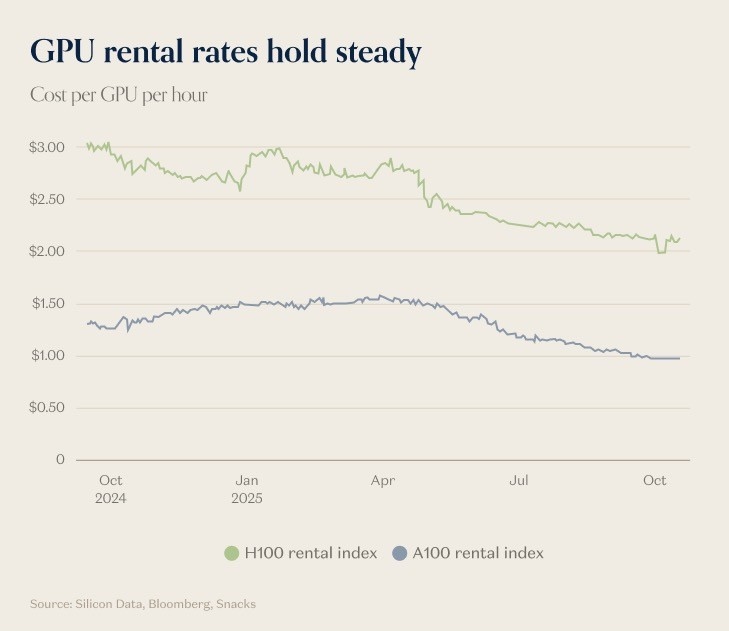
Example 1: GPU Rental Rate Trends
Andreessen Horowitz analysis showing GPU rental rates remaining relatively stable between October 2024 and October 2025, contrary to expectations of significant decline.
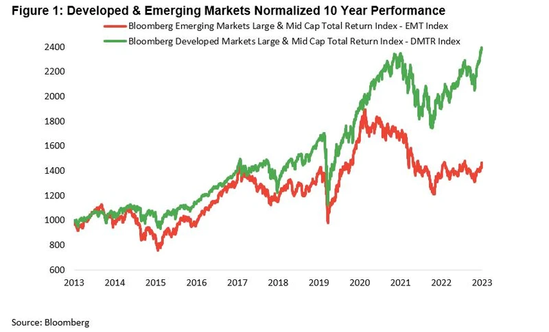
Example 2: Developed vs. Emerging Markets
Bloomberg Businessweek comparison of normalized 10-year market performance between developed and emerging markets starting in 2013.
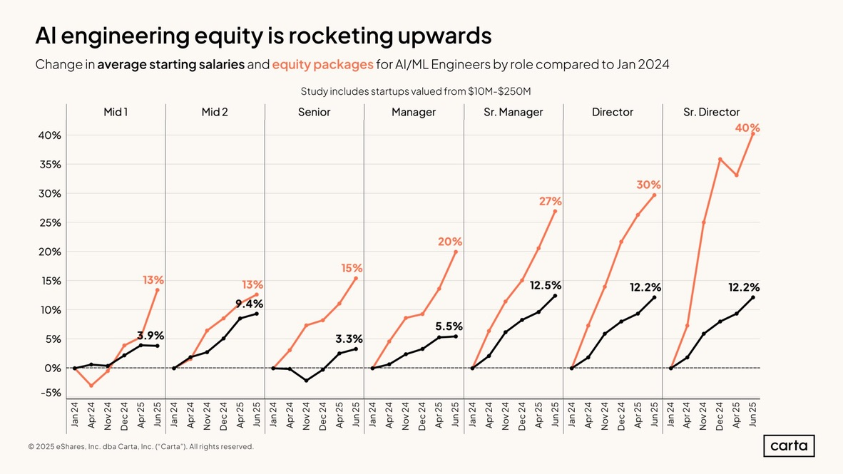
Example 3: AI Engineering Equity Growth
Carta's analysis showing AI engineering equity compensation rocketing upwards, demonstrating the explosive growth in AI talent valuation.
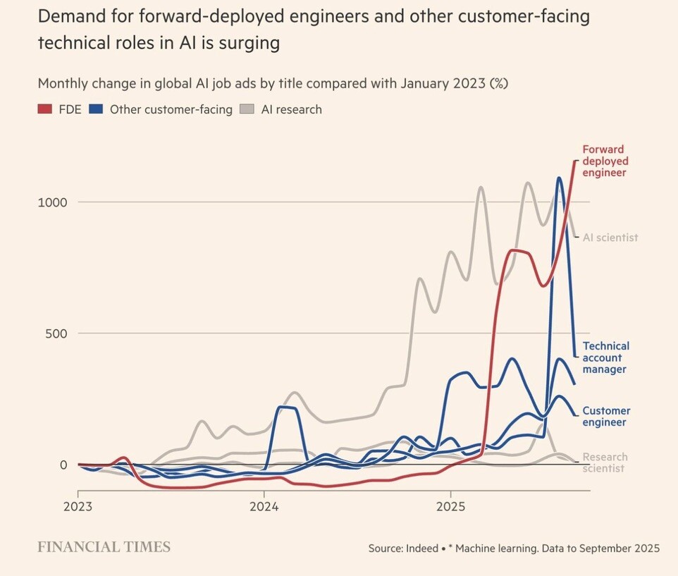
Example 4: Forward-Deployed Engineer Demand
Financial Times tracking surging demand for forward-deployed engineers and customer-facing technical roles in AI companies.
Example 5: Stripe's Growth to $106B
Gain.pro visualization of Stripe's meteoric rise to a $106 billion valuation through the 2010s and early 2020s.

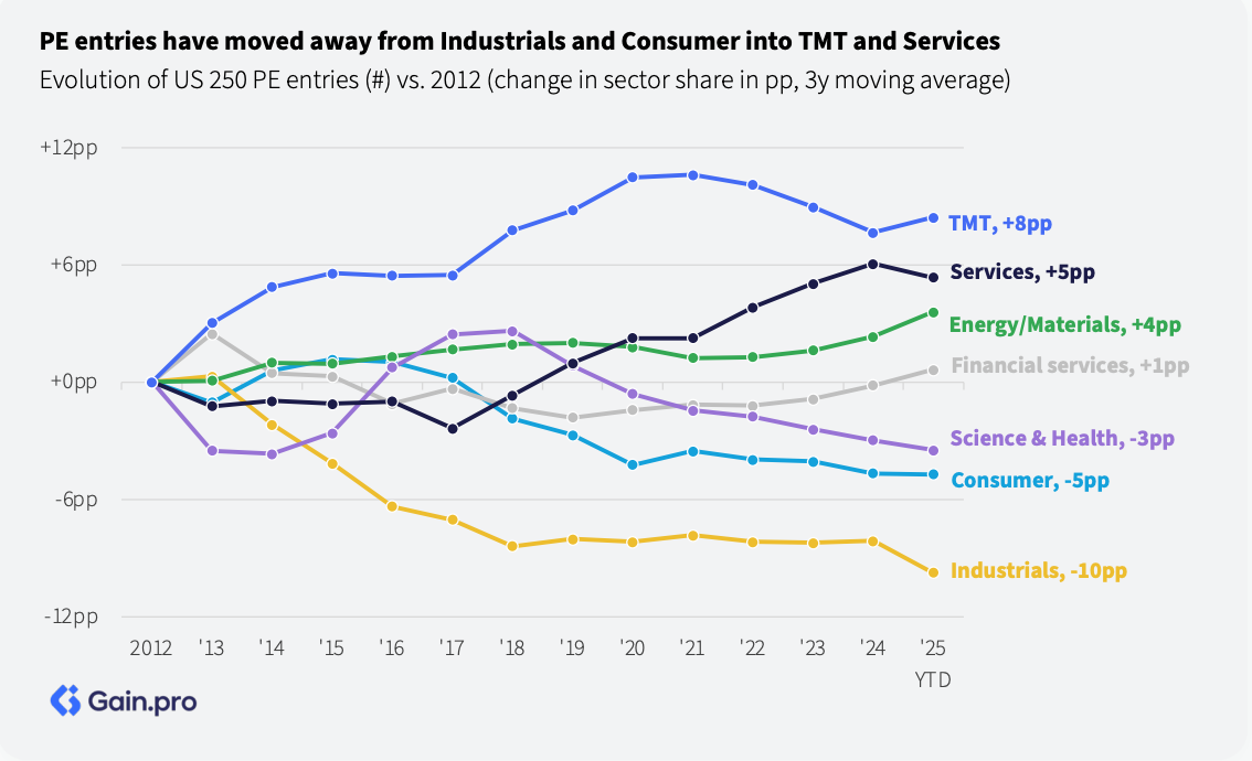
Example 6: US 250 PE Entries Evolution
Gain.pro tracking the evolution of US 250 private equity entries from 2012 to 2025, showing investment cycle patterns.
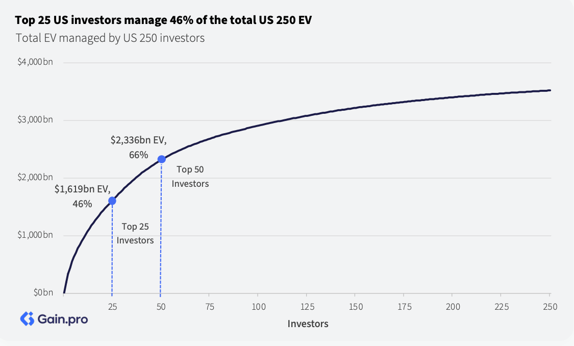
Example 7: Total EV Managed by US 250
Gain.pro analysis showing total enterprise value managed by US 250 investors, ranked across the investor spectrum.
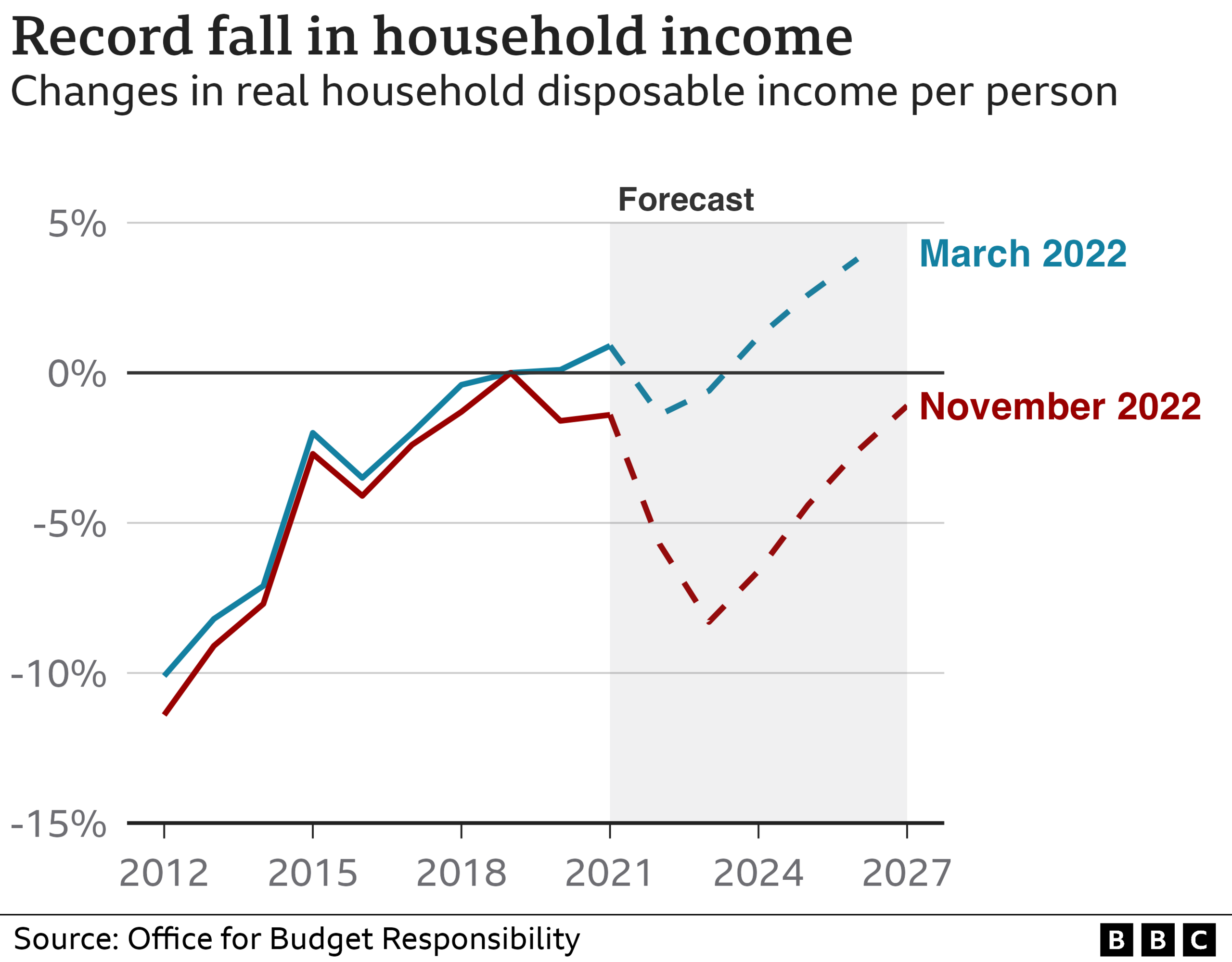
Example 8: UK Household Income Crisis
BBC analysis showing record fall in UK household income through changes in real household disposable income per person from 2012 to 2027.
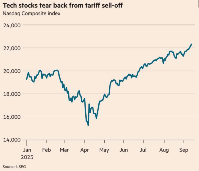
Example 9: Nasdaq Post-Tariff Recovery
Financial Times tracking the Nasdaq Composite index following the tariff sell-off of early 2025, showing the market bounce-back through late 2026.
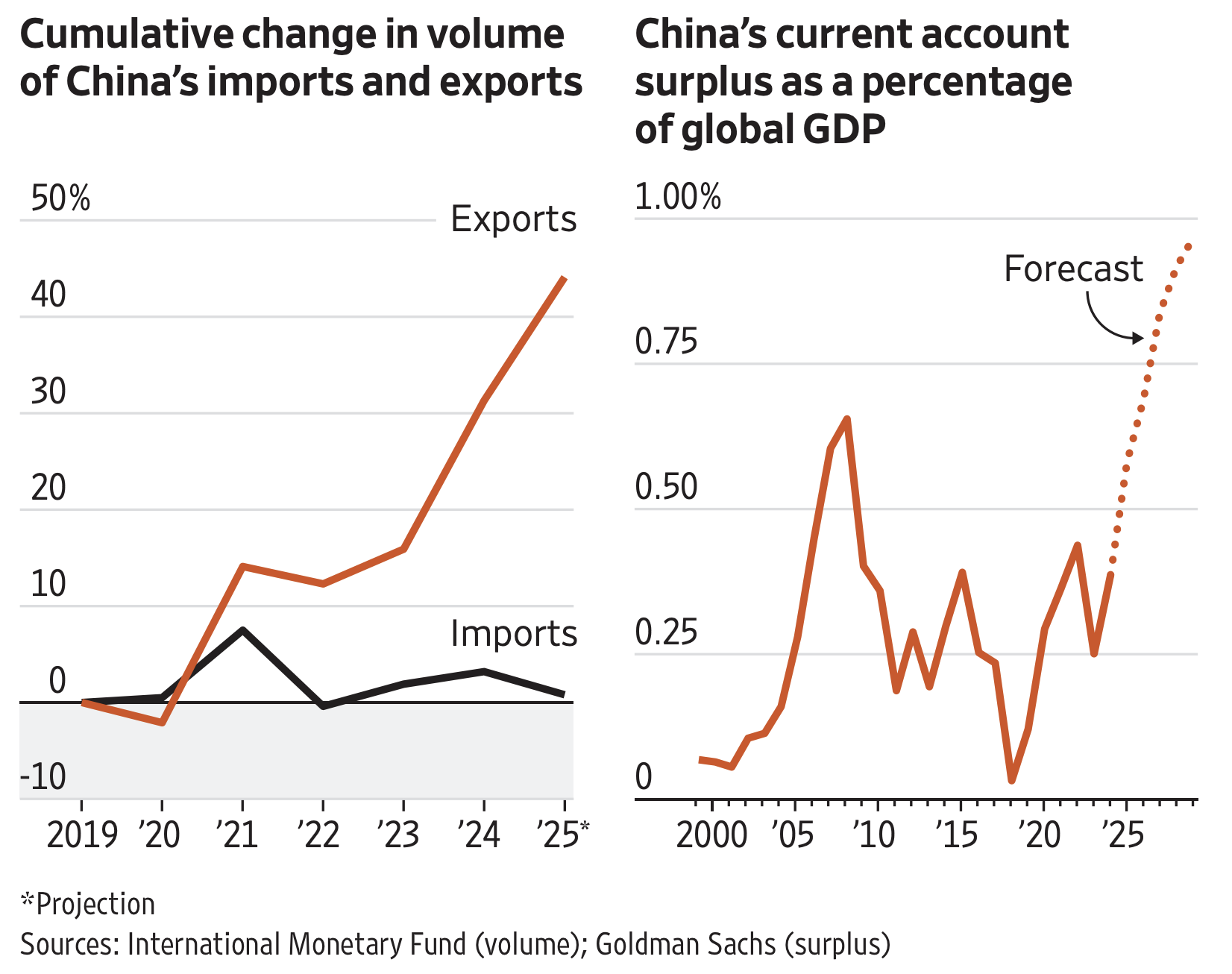
Example 10: China Trade Balance Evolution
Wall Street Journal visualization of cumulative changes in China's imports, exports, and current account surplus as a percentage of global GDP.
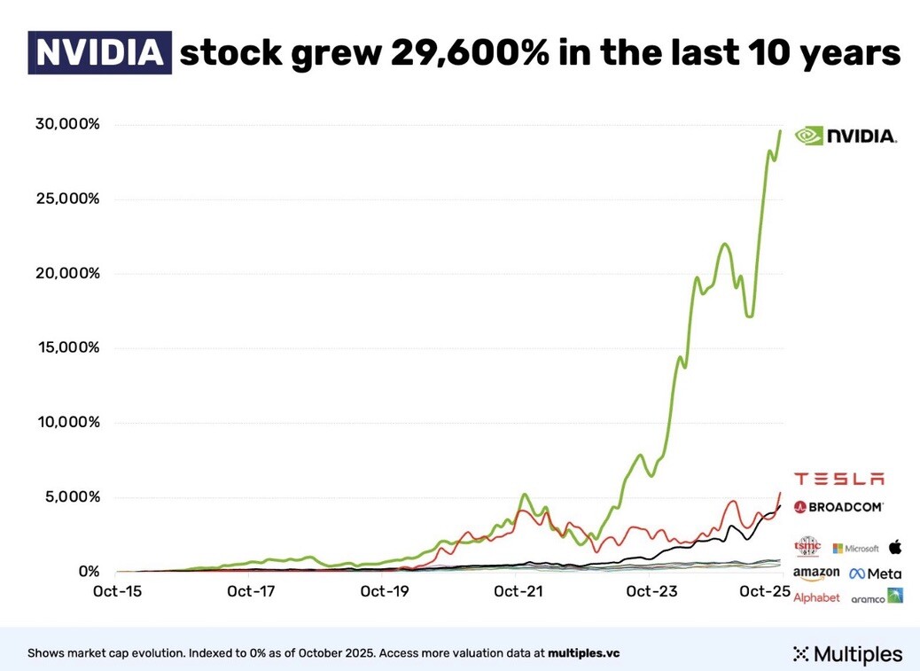
Example 11: Nvidia Stock Growth
XMultiples analysis showing Nvidia's extraordinary 29,600% stock growth over the last 10 years through 2025.
Example 12: VCs and Repeat Founders
Carta data demonstrating that venture capitalists disproportionately fund repeat founders compared to first-time entrepreneurs.

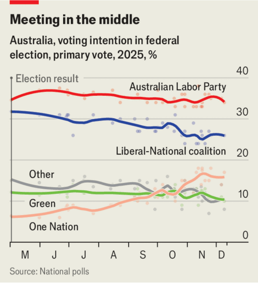
Example 13: Australia Voting Intentions 2025
The Economist tracking primary vote intentions for Australian federal elections in 2025, including Labor Party, Liberal-National Coalition, Greens, and One Nation.
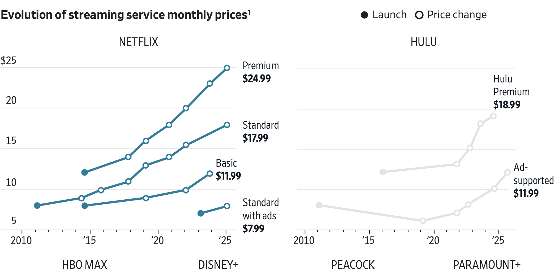
Example 14: Streaming Service Price Evolution
Wall Street Journal analysis of monthly price changes for major streaming services (HBO Max, Disney+, Peacock, Paramount+).
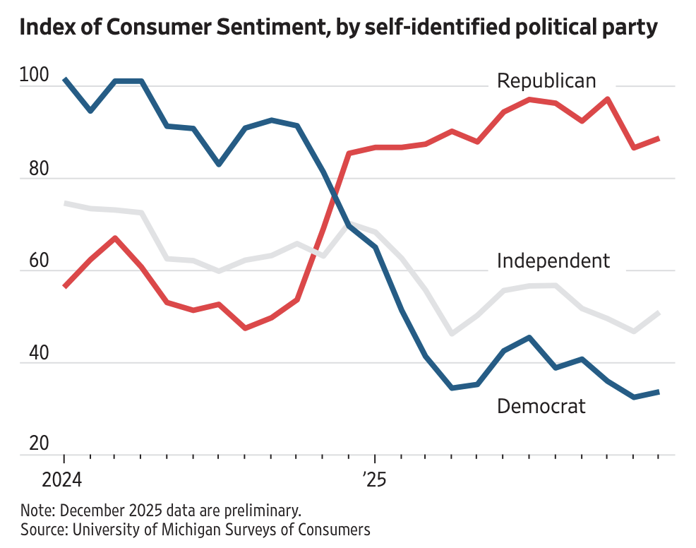
Example 15: Consumer Sentiment by Political Party
Wall Street Journal tracking consumer sentiment index segmented by self-identified political party affiliation, revealing partisan economic perceptions.
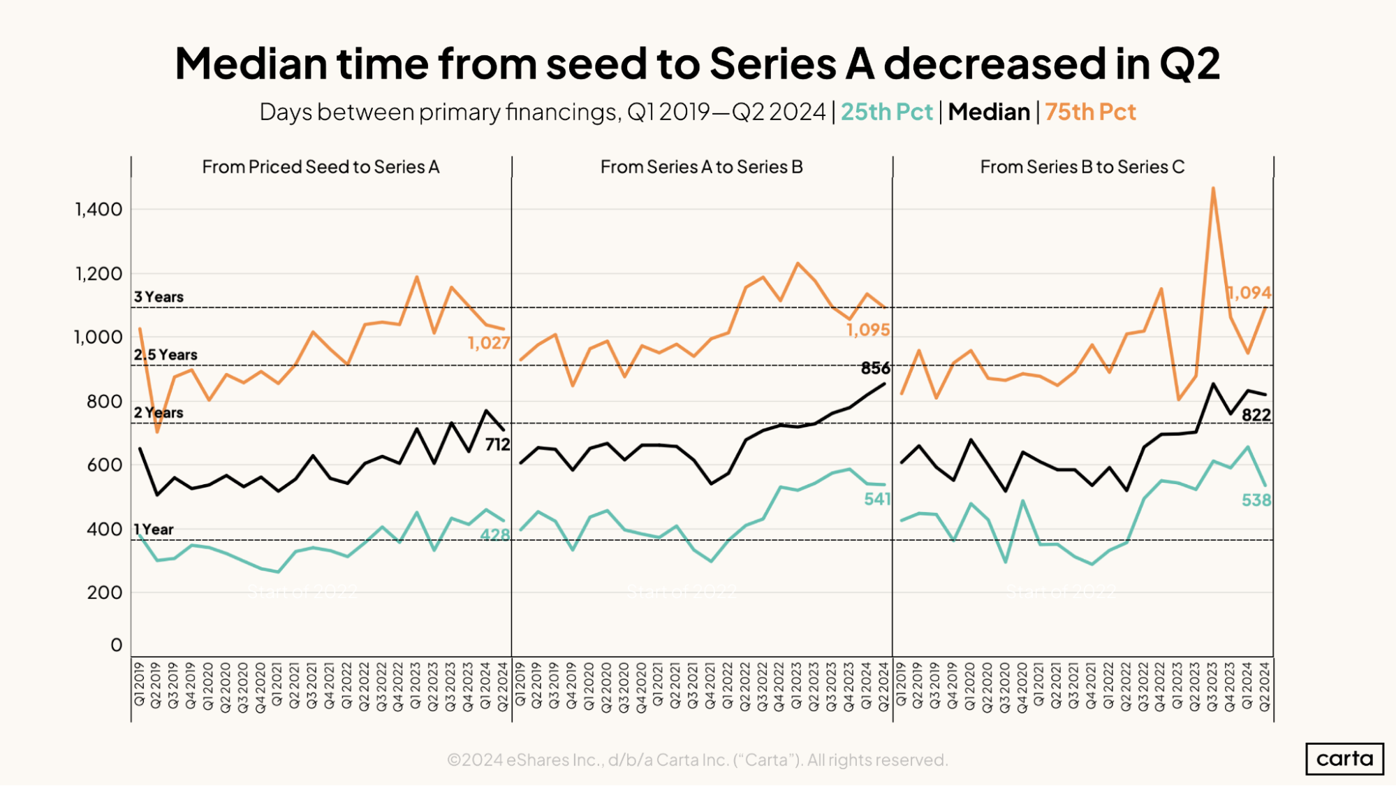
Example 16: Seed to Series A Timeline
Median time from seed funding to Series A decreased in Q2, showing faster fundraising cycles in the startup ecosystem.
Sources & Attribution
The charts featured in this article come from leading publications and data platforms:
- The Economist - Australia voting intentions
- Financial Times - Nasdaq recovery, forward-deployed engineers
- Wall Street Journal - Streaming prices, consumer sentiment, China trade
- BBC - UK household income
- Andreessen Horowitz - GPU rental rates
- Carta - AI engineering equity, repeat founders, Series A timeline
- Gain.pro - Stripe growth, PE entries, EV managed
- XMultiples - Nvidia stock growth
- Bloomberg Businessweek - Market performance comparison
Create Professional Line Charts in Google Slides
Need to create trend visualizations for presentations? Chartbuddy brings professional line charts with advanced styling and customization directly to Google Slides.
Install Chartbuddy