Bar Chart Examples: Real-World Applications and Best Practices
Bar charts are the workhorse of data visualization - simple, effective, and universally understood. From startup metrics to venture capital trends, bar charts excel at comparing values across categories and revealing patterns that drive decision-making.
This collection showcases 15 real-world bar charts from leading publications and data platforms including The Economist, Wall Street Journal, Carta, and Gain.pro. Each example demonstrates how professional organizations use bar charts to communicate insights clearly and compellingly.
Example 1: Doctor Burnout by Country
The Economist's analysis showing burnout rates among medical doctors across countries, with the US leading at over 40%.

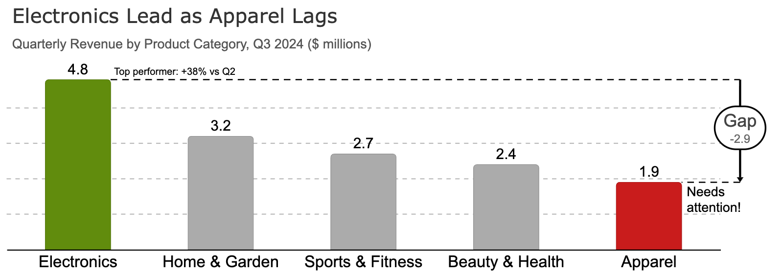
Example 2: Product Sales Comparison
Quarterly sales comparison across five product categories, highlighting Electronics as the top performer with strategic use of color emphasis.
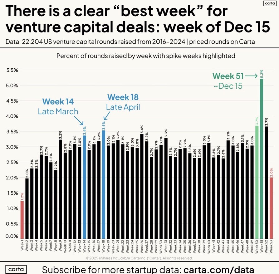
Example 3: Venture Capital Activity Peak
Carta's analysis of the best week for venture capital funding, showing investment activity patterns over time.
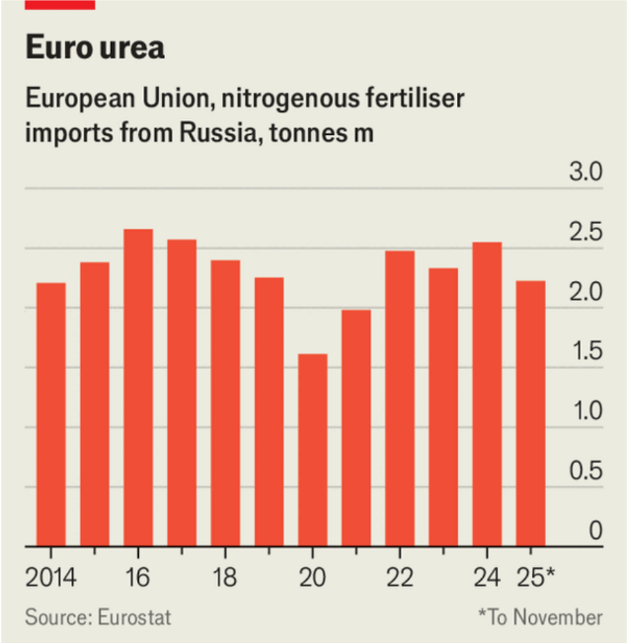
Example 4: Russian Fertilizer Imports
The Economist tracks nitrogenous fertilizer imports from Russia (2014-2025), showing relative stability despite geopolitical tensions.
Example 5: AI Job Market Transformation
Percentage change comparison between AI engineering roles and traditional non-engineering positions, revealing the shift in tech job markets.

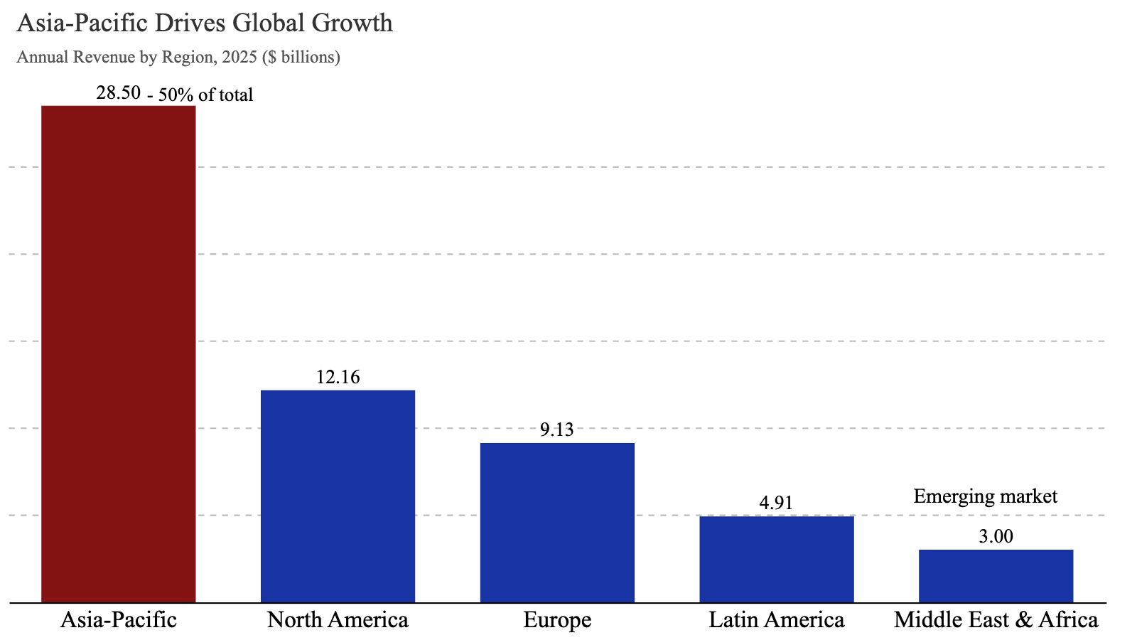
Example 6: Regional Sales Performance
Annual revenue comparison across global regions, demonstrating Asia-Pacific's market leadership.
Example 7: Sports Betting Awareness by Age
The Economist's "Lopsided Wager" analysis showing whether different age groups know someone with a sports betting problem, revealing generational differences.

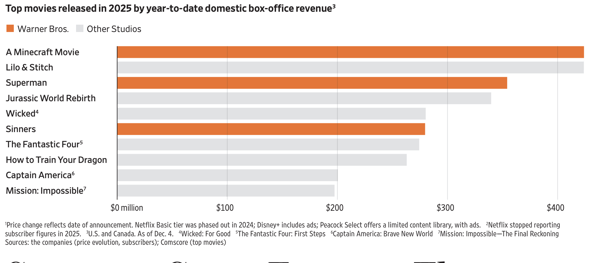
Example 8: Box Office Performance 2025
Wall Street Journal's analysis of top movies by year-to-date domestic box office revenue, showing which films dominated the theatrical market.
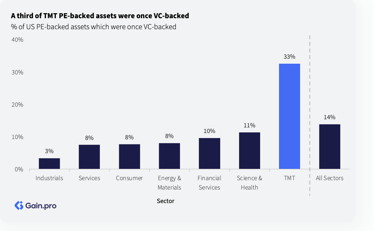
Example 9: TMT PE/VC Asset Overlap
Gain.pro analysis revealing that a third of TMT (Technology, Media, Telecom) private equity-backed assets were previously venture capital-backed, showing the investment lifecycle.
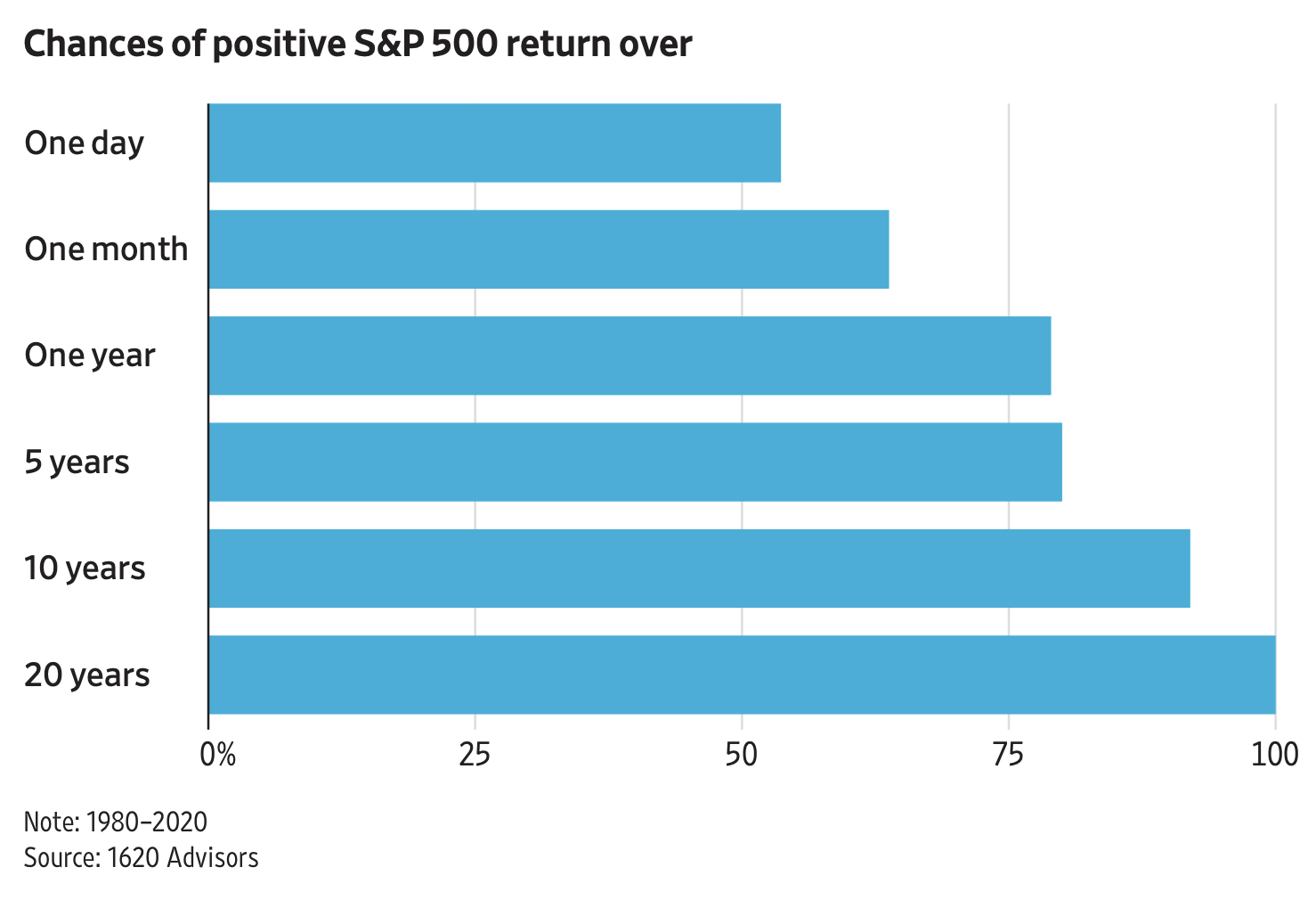
Example 10: S&P 500 Returns by Time Horizon
Probability of positive returns on the S&P 500 across different investment horizons - one day, one month, one year, 5 years, 10 years, and 20 years.
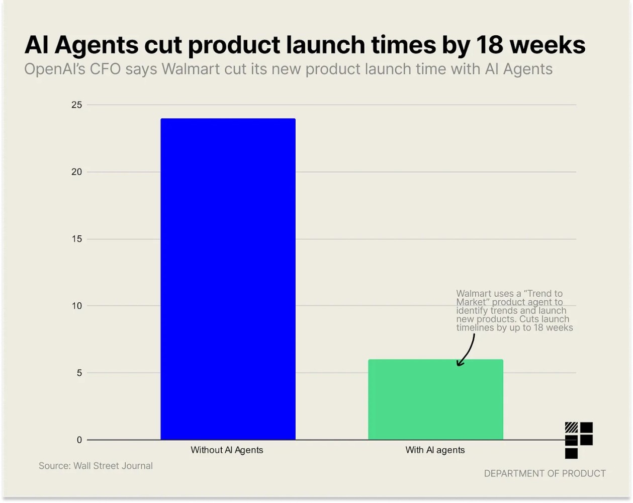
Example 11: AI Impact on Product Development
Department-level analysis showing how AI agents reduced product launch times by 18 weeks, with insights by department.
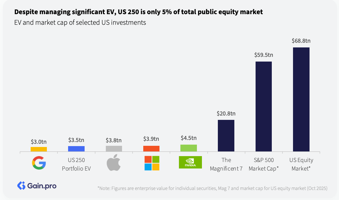
Example 12: US 250 Market Share Analysis
Gain.pro insight showing that despite managing significant enterprise value, the US 250 represents only 5% of the total public equity market.
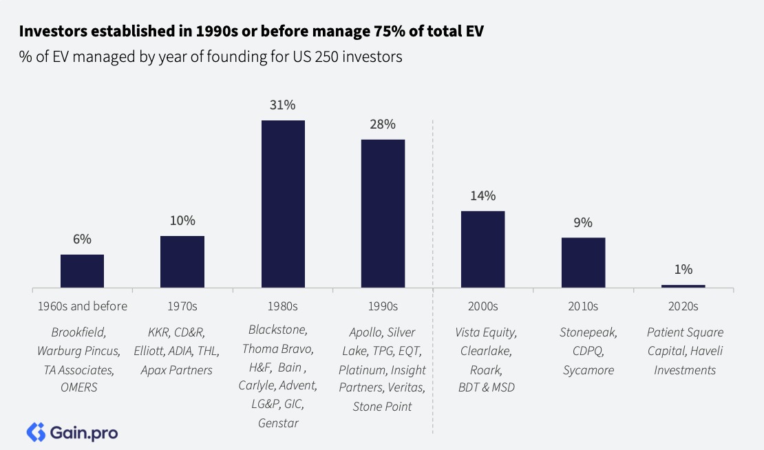
Example 13: Investor Experience and EV Holdings
Analysis showing how professional investors established in the 1990s or earlier hold more EV (enterprise value) positions.
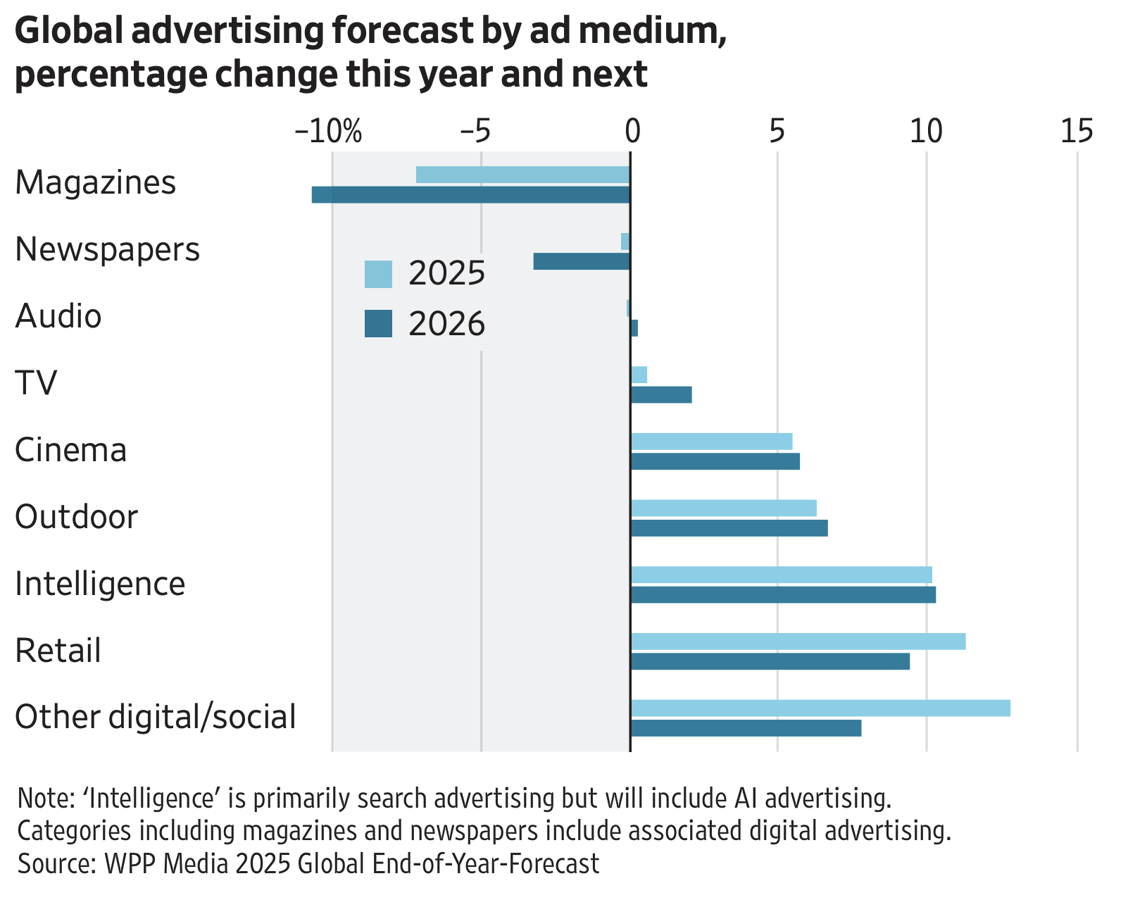
Example 14: Global Advertising Forecast
Wall Street Journal's analysis of advertising medium growth, showing percentage changes across different media channels for 2025-2026 based on WPP Media data.
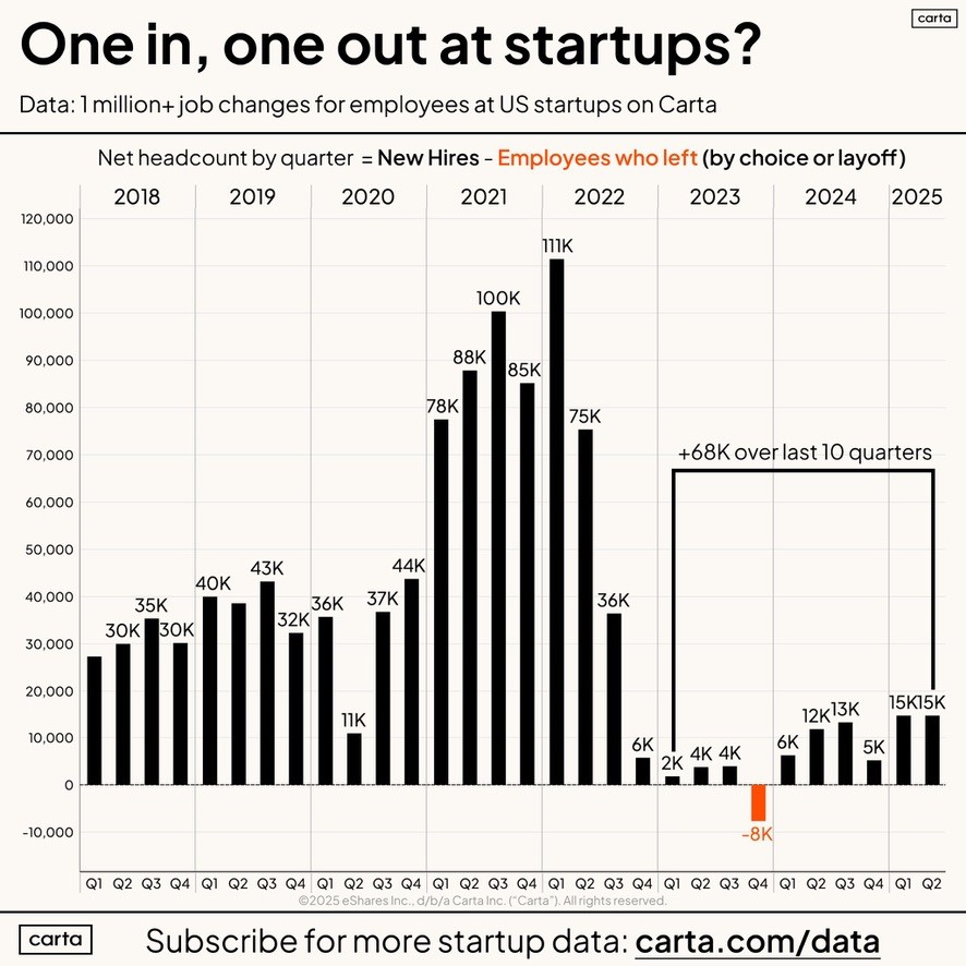
Example 15: Startup Hiring Trends
Net headcount changes by quarter for US startup employees on Carta's platform, revealing hiring and layoff cycles.
Sources & Attribution
The charts featured in this article come from leading publications and data platforms:
- The Economist - Doctor burnout, fertilizer imports, sports betting awareness
- Wall Street Journal - Box office revenue, advertising forecast
- Carta - Venture capital activity, startup hiring trends
- Gain.pro - Investor analysis, PE/VC insights, market share data
- Chartbuddy - Product and regional sales examples
Create Professional Bar Charts in Google Slides
Need to create these types of charts for presentations? Chartbuddy brings professional bar charts (including grouped, stacked, and waterfall variants) directly to Google Slides with easy data entry and beautiful styling.
Install Chartbuddy